
Background Image Sizing

When you are setting up your site and you want to place an image behind some content or to cover a whole area it is import to understand a few key options in terms of background size. Here is a quick tutorial outlining the important things to grasp when setting up your background.
Now a background image is just that it’s a background so you cannot set the size of an area by adding a certain size background image. The size of whatever you’re adding this background image to will be determined by the content that is within the container. What you can determine with a background is how that image fills the space of the container.
Let’s start with an example using an image that is a 2×1 ratio. Meaning for every 2px it is wide, it’s 1px tall. In the images below we’ve outlined two screen sizes, one that is a desktop and one that is mobile to show how each size setting works.
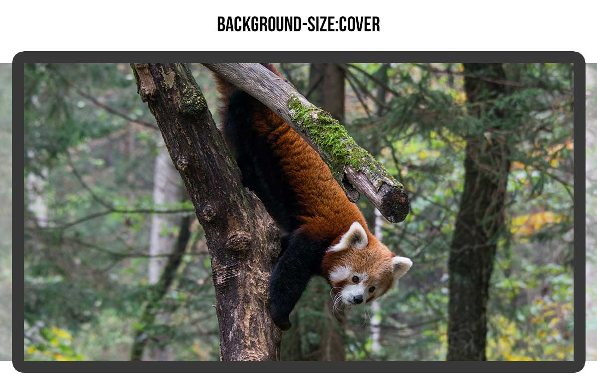
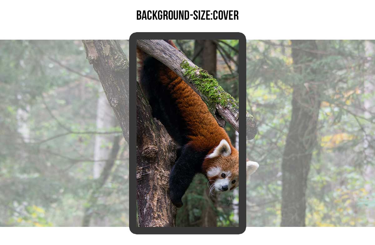
Background Size: Cover
This option will make sure there are no empty spaces in the container that are not filled with the background image. It does this while respecting your image ratio so it will stretch the image always to fill, but will not distort it out of the image ratio. Meaning you will have parts of the image that are off the screen and not seen.
[columns] [span6]
[/span6][span6]
[/span6][/columns]
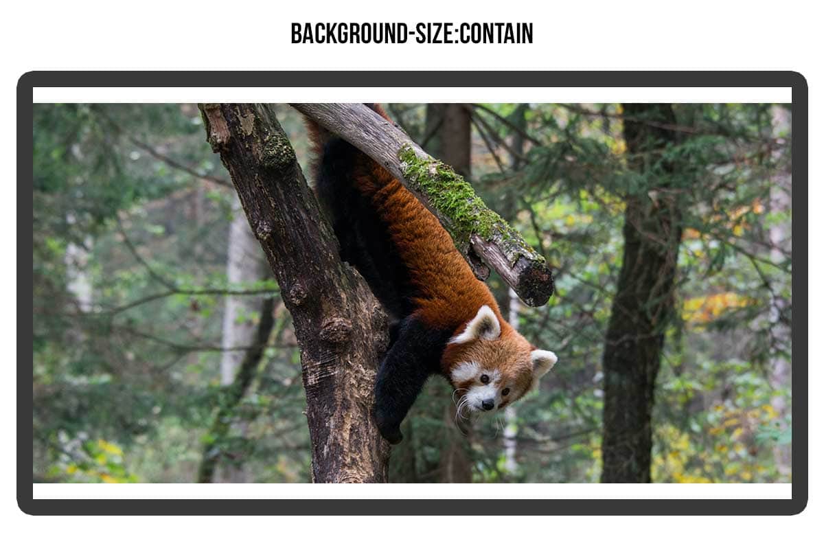
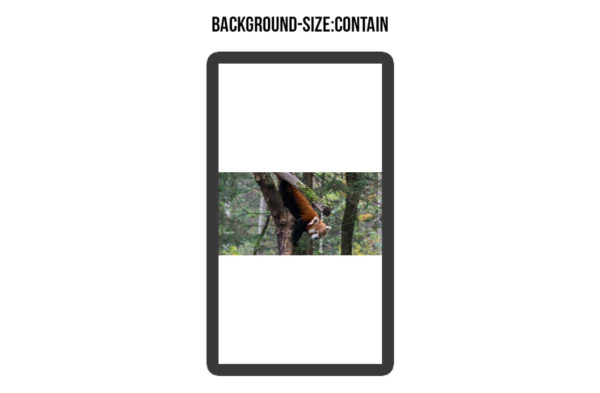
Background Size: Contain
This contain option will respect the ratio of your image and make sure none of the image is off screen so you will always see the full image in the correct ratio.
[columns] [span6]
[/span6][span6]
[/span6][/columns]
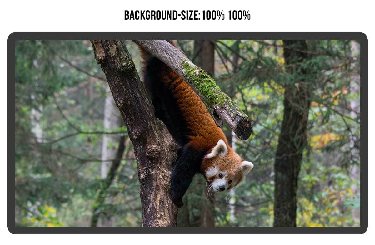
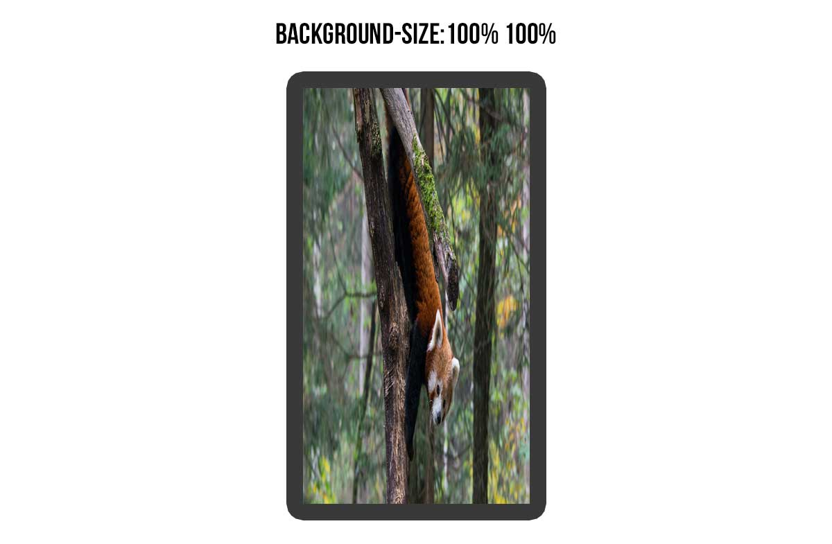
Background size: 100% 100%
This 100% 100% option will not protect the ratio of your image. So the image will stretch or distort to fill the space while showing the complete image.
[columns] [span6]
[/span6][span6]
[/span6][/columns]
I hope that helps to explain background sizing options.
Parallax Backgrounds
One of the fun features in our premium themes is the ability to add parallax backgrounds. Check out the “want to see more” section of this demo.
The background options for this can be found in your page-builder row styles. I want to briefly explain how parallax is different from “background-size: cover”.
Background cover only has to fill the space of the container. So if your container is 400px high then that’s as tall as the image needs to be. But parallax has to fill the entire height of the screen because it’s set to be fixed behind your content. So it doesn’t matter how tall your container is that you want to have a parallax background with.
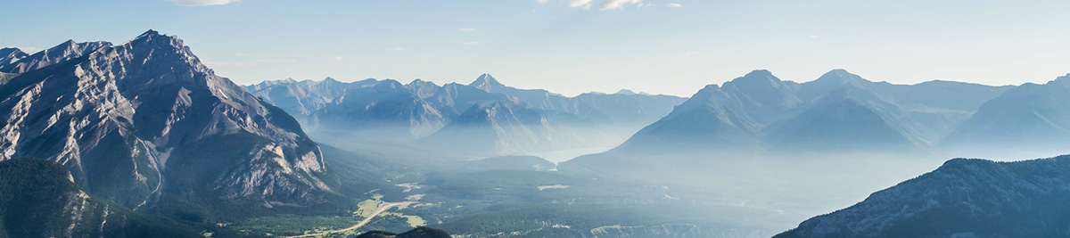
Here is an example that will hopefully clarify. Let’s say I used this image:
Below are two examples, one with the background set to cover and one with the background set to parallax.
[columns] [span6]
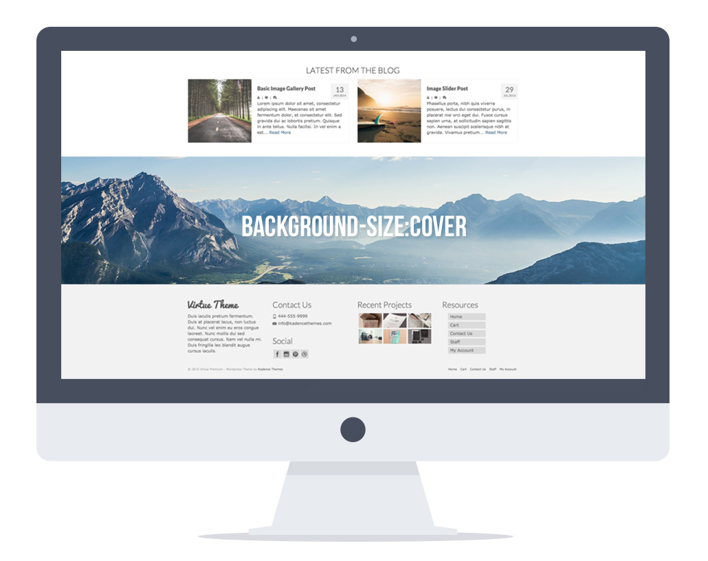
Notice how you see all of the image because the ratio matches that of the container.
[/span6][span6]
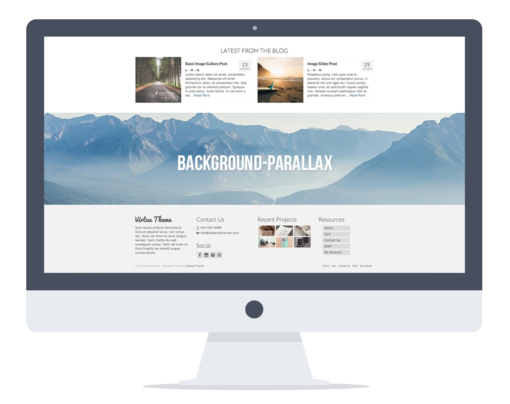
Notice here how zoomed in the image has to be. That is because the image has to be stretched to fill the height of the screen size not the container for the parallax area. This allows for the background to scroll behind the image as your scroll on the page.
[/span6][/columns]
For parallax backgrounds I recommend using images around 2000px wide and 1200px tall.
